Sunday, 23 October 2011
Week 13: Drawing Documentation
DESIGN DRAWINGS
GROUND FLOOOR PLAN
FIRST FLOOR PLAN
SECOND FLOOR PLAN
THIRD FLOOR PLAN
SOUTH ELEVATION
EAST ELEVATION
NORTH ELEVATION
WEST ELEVATION
LONG SECTION
CROSS SECTION
Sunday, 16 October 2011
Monday, 10 October 2011
Week 12: 500 word text
Architect- Ian Moore
Ian Moore’s Architecture is most often associated with minimalism. His architecture is contemporary and consists of clean lines composed solely of horizontal and vertical planes. Hard edges, sparse detailing, large expanses of glazing and extensive use of shutters and louvre blinds are found in all of his designs. The architecture consists of simple geometric structures that create open spaces which have a flow connection between interior and exterior spaces and the two spaces are connected visually. The interiors are characterized by white space and a neutral colour palette.
Concept
To re-interpret Ian Moore’s ‘Frangipani’ a small residential building located in Bondi, Sydney. The main idea was to recreate ‘The grid’. As Ian Moore uses clean horizontal and vertical lines I sought to create an irregular grid. I researched the idea and come across shell architecture that encases existing structures this would create a public space for the architecture as well as privacy and decoration. Water is a major factor of the design of the building so I wanted to incorporate this idea into the irregular grid to resemble water movement and the organic shapes it would produce. As contemporary design is my preferred architecture I also wanted to recreate ‘Frangipani’ into a public multi storey building. This would allow for the users of the building to enjoy the indoor/outdoor relationship through the architecture. I used elements from the architects design principles including the simple box structures that are oddly arranged and cantilevered to create outdoor protected spaces.
Aspects of the Architecture
The aspects of the architecture that inspired my works are the grid, site context and use of project. As Ian Moore uses clean horizontal and vertical lines throughout the design of his building I sought to create an irregular grid to create the outer shell of the Architecture. The location of Frangipani is designed entirely around the location, practically on the shoreline of Sydney’s iconic Bondi Beach. The reinterpretation of the Architecture is situated along the shores of the island of Florianopolis, Brazil. Frangipani is a small residential building consisting of three open apartments, for my re-interpretation I wanted to create a public space for the community and visitors to explore and take in the location. The building is designed as a public beach pavilion and the outer shell shades and protects the visitors as well as creating an iconic Architecture that complements the site.
My architecture
Outer shell
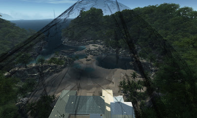
I sought to create an organic shape that was heavily influenced by the movement of water. The structure follows an unordered grid and creates an outer shell for my re-interpretation of the Architecture. The shell encases the public pavilion and provides a unique iconic feature of the site location. The structure is created with fragmented geometry and has multiple perspective points but appears to be ordered. It forms a public space for the community and visitors. The material of the structure includes steel gridshell and metal mesh cladding
Architecture
My reinterpretation of Ian Moore’s Frangipani was composed by ‘the grid’, an ordered structure of horizontal and vertical lines. The simple geometric shapes transform into a cluster that forms a complex structure. The construction cantilevers above lower courtyard apartments providing the building with its distinctive dynamic form. The site context was also of great importance in the orientation of the structures. They provide a sequence of spaces orientated by a large pool and courtyard which is placed on the shoreline of a protected bay. The interior and exterior spaces are connected visually to achieve a total integration to the surrounding landscapes. The collection of rooms with floor to ceiling glazing take in the views and draw a definite line to the horizon.
Sunday, 9 October 2011
Week 12: First Draft Layout
Draft 01: To construct a triangle grid, to continue through the 3 page spread. Selecting triangle spaces that will show the content forming geometric shapes.This will benefit for the interactive PDF where interactive imagery and videos can change the grid.
An interesting design page that also follows a grid which is structured but not using clean horizontal and vertical lines.
Subscribe to:
Posts (Atom)


